WidgetKit-OS18 Themes & Icons
- 4.7
- Rating
- 10.00M
- Installs
- Free
- Price
 Analysis by App-foxy
I spent time with WidgetKit-OS18 Themes & Icons as a personalization app, focusing on the parts that matter after the initial download: how much creative control it gives you, whether the free access feels useful, and where the polished appearance comes with compromises. My first impression was that it is aimed at people who want their phone to feel deliberately styled rather than assembled from unrelated wallpapers, icons, and widgets.
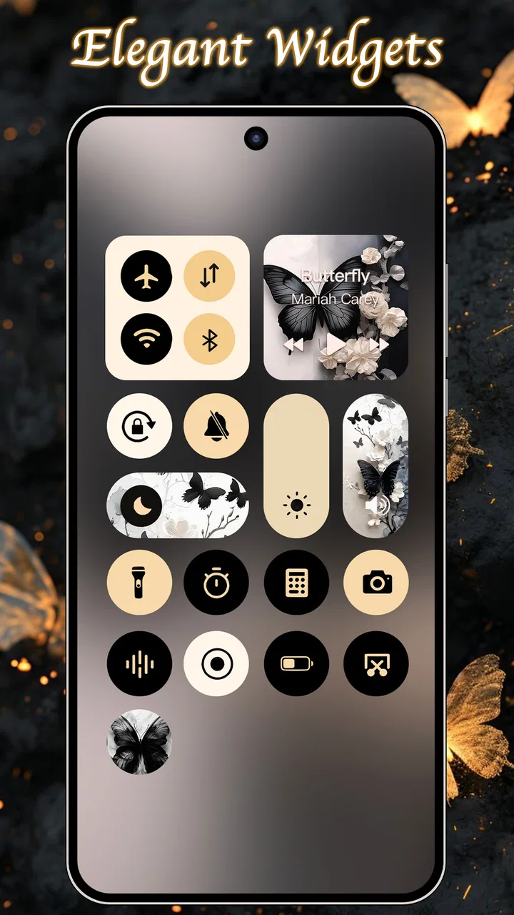
The central idea is simple: use coordinated visual elements to turn the home screen into a more complete design. That includes widgets, themes, wallpapers, and icons, so the app is more useful as a matching toolkit than as a single wallpaper browser. I found that distinction important. If you only want one background image, a regular wallpaper app may be quicker. If you want several parts of the screen to share one mood, this app makes more sense.
How the app feels in everyday use
The app comes from ThemeKit and sits in the personalization category. Its store identity is closely tied to the OS18-inspired look, but I would not treat it as a system replacement. It is better understood as a visual layer for your existing phone: a way to organize the appearance of the home screen without changing the phone’s underlying operating system.
You May Also Like

 Blood Strike: 2.5 Anniversary
Blood Strike’s Loadouts Turn Every Drop Into a Tactical Gamble
A close look at Blood Strike’s custom loadouts: how fast access to signature weapons reshapes its battle royale rhythm, rewards preparation, and narrows the gap between fights.

 Pandora - Music & Podcasts
Pandora’s Music Is Easy to Start, but Harder to Recover
Pandora’s strength is its low-effort path from a seed to a station. Its weak spot is how much confidence it asks you to place in connection, setup, and quiet recovery.

 8 Ball Pool
 Is Built on Rivalries, Rematches, and Routine
A close look at the rivalries, rematches, shared routines, and unanswered safety questions that turn a quick pool match into a persistent mobile community.

 Samsung Music
’s Quiet Strength Is Playing What You Already Own
Its reach comes less from spectacle than from dependable access to a personal library. That simplicity is both the app’s strongest retention engine and its ceiling.

 AccuWeather: Weather Radar
AccuWeather Review: A Quick, Clear Forecast for Everyday Decisions
For everyday plans, the best forecast is the one you can understand quickly. AccuWeather makes rain timing, radar, and local conditions easy to act on, with a few trade-offs.

 Hill Climb Racing
Why Hill Climb Racing Still Turns Crashes Into One More Run
A tiny car, a bumpy hill and one more upgrade: Hill Climb Racing keeps resurfacing because its simple chaos makes every near-miss feel personal.
More From Our News Desk



That makes the experience approachable for someone who has never built a custom setup before. Instead of beginning with a blank canvas and hunting through unrelated sources, you can start from a visual direction and decide how far you want to take it. A coordinated theme can save time, especially when you want the wallpaper, icons, and widgets to look as though they belong together.
One practical scenario is a workday setup. I would choose a restrained wallpaper, keep the widget area focused on information I check often, and use icons that are easy to recognize rather than merely decorative. In the evening, a darker theme can make the same phone feel less busy. The useful part is not just the individual artwork; it is being able to think of the screen as one composition and adjust it around how I actually use the device.
The app is free to install, which lowers the barrier to trying it. There are also in-app purchases ranging from $0.49 to $34.99 per item. That range matters when judging value: free access gives you a chance to decide whether the style and workflow suit you, while paid items can become a larger commitment if you want to build a complete collection rather than test a few visual changes.
I appreciate that the cost question is relatively easy to frame. You do not need to pay simply to find out whether the app’s approach appeals to you. At the same time, “free” should not be confused with unlimited access to every desirable design. The sensible approach is to explore first, identify the parts you would genuinely use, and only then consider a purchase. I would be cautious about buying several individual items before seeing how well they work together on my particular screen.
Where the value comes from
The strongest value is convenience. A home-screen makeover normally involves collecting visual elements from several places, checking whether colors clash, and repeatedly adjusting the arrangement. WidgetKit-OS18 Themes & Icons brings the concept of a unified style into one app, which reduces that searching and decision fatigue.
That is especially helpful for people who care about visual consistency but do not want to design every element themselves. The app can act as a starting point for a themed setup, then you can keep only the pieces that are practical. I would not blindly apply every decorative element. A good result usually comes from choosing one focal point, such as a wallpaper, and letting the other components support it rather than compete with it.
A less obvious benefit is that themed design can make a messy phone feel easier to manage. This is not because the app changes how applications work. It is because a consistent visual treatment can help separate a clean first page from less frequently used pages. I like the idea of keeping the first screen calm, placing the most important information in a widget, and moving novelty icons or more expressive artwork away from the area I use for quick actions.
Another useful workflow is to treat the app as a seasonal or situational refresh rather than a permanent commitment. A bright arrangement can suit a personal phone, while a subdued one may be more comfortable when the device is used around clients or during study. Since the app is about presentation, its value depends on whether you enjoy changing that presentation. Someone who sets a wallpaper once and never revisits the home screen will probably get less from it.
The app has attracted a 4.7 average from around 325 thousand ratings and has passed 10 million installs. Those figures suggest that the concept has broad appeal, but they do not remove the need for personal testing. A highly rated personalization app can still be a poor fit if its visual language is not your taste or if you prefer the simplicity of the phone’s default appearance.
What I would check before committing to a full setup
I would begin with the wallpaper, not the icons. The wallpaper occupies the largest visual area and determines whether the rest of the screen will feel calm, colorful, dark, or crowded. Once that choice is made, I would add a widget only where it replaces a real habit, such as checking information at a glance. Decorative widgets can look impressive in screenshots but may make the screen less efficient if they push useful shortcuts out of reach.
I would also compare readability at different times of day. A design that looks excellent in a bright preview may make labels or small widget text harder to distinguish in normal use. This is one of the trade-offs of prioritizing appearance. The most attractive arrangement is not always the most comfortable one, particularly when the screen contains pale artwork, fine details, or low-contrast elements.
For icons, recognition matters more than perfect matching. If a theme makes every icon look similar, I may spend more time searching for familiar apps. My preferred compromise is to use the strongest visual changes on the main page and keep a more functional arrangement elsewhere. That gives the phone personality without turning every launch into a visual scavenger hunt.
The store describes the app as WidgetKit-OS18, and the current version is 13.6. It supports Android 6.0 and later, which makes it accessible to a wide range of Android phones. The Teen content rating is another detail parents and younger users should notice before installing. It does not tell me how every individual design will feel, but it is part of the app’s official positioning and worth considering when choosing personalization content for a shared or supervised device.
The trade-offs behind the polished look
The biggest limitation is that personalization can become work. The more complete the makeover, the more time I spend deciding which elements to place, which shortcuts to keep, and whether the result remains convenient. An app like this solves part of the design problem, but it does not eliminate the need to make choices. People looking for a single tap that permanently improves every screen may find the process more involved than expected.
There is also a tension between novelty and usability. A dramatic theme can make the phone feel new for a while, yet a busy layout may become tiring after daily use. I would avoid judging a design only from its preview. The real test is whether I can find frequently used apps quickly, read widget information without effort, and use the phone comfortably when I am in a hurry.
Another trade-off concerns paid value. The free installation is a strong invitation to experiment, but the presence of item-based purchases means the final cost depends on how much of the catalog I want. A person who is satisfied with a small refresh may spend nothing. Someone who wants several complete looks could spend considerably more, with the upper listed item price reaching $34.99. I would therefore treat purchases as optional design upgrades, not as an assumed requirement for basic use.
Compared with the usual alternatives, the app’s advantage is coordination. A default launcher and system wallpaper tools are usually more straightforward and may be better for someone who values speed, consistency, and minimal maintenance. Separate wallpaper and icon sources can offer a wider mix of styles, but they also require more effort to make the pieces match. WidgetKit-OS18 Themes & Icons occupies the middle ground: more expressive than default customization, but more guided than building everything from unrelated sources.
That middle position will not suit everyone. If I want precise control over every icon, spacing decision, and widget detail, a more specialized launcher or manual setup may be preferable. If I want the lowest possible visual friction, the stock home screen remains the better choice. This app is most convincing when I want an attractive direction quickly and am willing to accept some design decisions made for me.
Who is likely to get the most from it
I would recommend it first to Android users who see their home screen as part of their personal style. It is a good match for someone who enjoys changing wallpapers, likes coordinated colors, or wants a more expressive phone without designing every asset from scratch. It can also help a new phone feel personal sooner, especially when the default layout looks too plain or disconnected from the owner’s taste.
It may suit students, creators, and anyone who uses different visual moods for different routines. A focused study layout, a calmer evening arrangement, or a bright weekend style can make the device feel less monotonous. The practical trick is to keep separate purposes in mind instead of endlessly decorating the same screen. A theme should support the way I use the phone, not become another task I have to maintain.
I would be more hesitant to recommend it to someone who dislikes visual changes, needs maximum battery and attention efficiency from a simple layout, or does not want to evaluate optional purchases. I would also skip it if my main goal were advanced home-screen automation or deep launcher control. The app’s appeal is visual personalization, not replacing every tool involved in managing an Android device.
People with older supported phones may appreciate the broad minimum-system requirement, but compatibility alone does not guarantee that every design will feel equally comfortable on every display. Screen size, resolution, and the existing launcher can affect the final impression. I would start with a modest change and see whether the result remains readable and practical before investing in a more elaborate theme.
My verdict on free access and paid extras
For me, the free entry point makes WidgetKit-OS18 Themes & Icons worth trying. It gives curious users a low-risk way to judge the visual direction, the usefulness of its widgets, and the amount of setup they are willing to do. I would not install it expecting the phone to be transformed automatically. The best results come from selecting a few coordinated elements and resisting the temptation to fill every available space.
Paid items can be worthwhile when a particular style solves a real problem for me, such as making a home screen feel organized or giving a frequently used device a more personal identity. They are less compelling when I am buying only because a preview looks attractive for a few seconds. Since individual purchases can range from $0.49 to $34.99, I would set a personal limit before browsing and judge each item by how often I expect to live with it, not by how impressive it looks in isolation.
My final recommendation is therefore selective rather than automatic. Try it if you want a coordinated visual refresh and enjoy making your phone feel distinctive. Keep the setup simple, test readability in ordinary daily conditions, and use the free access to learn whether the style fits you before paying. Skip it if you prefer the default Android experience, need deep technical customization, or see home-screen decoration as unnecessary maintenance.
In short, WidgetKit-OS18 Themes & Icons delivers its best value as a guided design kit. It does not need to replace the phone’s normal tools to be useful; it only needs to make the screen more coherent and enjoyable without getting in the way. For the right user, that balance is enough to justify keeping it installed. For everyone else, the free trial opportunity is the sensible stopping point.
FAQs for WidgetKit-OS18 Themes & Icons
01What features does WidgetKit-OS18 Themes & Icons offer?
WidgetKit-OS18 Themes & Icons provides a versatile collection of themes and icons designed to customize your smartphone's interface. With an extensive range of widgets, app icons, and color schemes, the app allows users to personalize their home screens effortlessly. It also supports custom widgets for weather, time, and calendar, enhancing functionality.
02Is WidgetKit-OS18 Themes & Icons compatible with all devices?
WidgetKit-OS18 is compatible with most Android and iOS devices. However, to ensure optimal performance, it is recommended to check the app's compatibility with your specific device model. The app is designed to support the latest operating systems, so make sure your device is up to date.
03Are there any subscription fees or in-app purchases?
WidgetKit-OS18 offers a free version with limited features, but to unlock the full range of customization options, users can opt for in-app purchases or a subscription plan. The premium version provides access to exclusive themes, widgets, and regular updates, enhancing the personalization experience.
04How user-friendly is WidgetKit-OS18 for beginners?
The app is designed with a user-friendly interface that caters to beginners and experienced users alike. It offers easy-to-follow tutorials and a simple navigation system. Users can quickly apply themes and customize their home screens without needing any technical knowledge, making it accessible for everyone.
05Does WidgetKit-OS18 affect device performance or battery life?
WidgetKit-OS18 is optimized to minimize impact on device performance and battery life. The app is designed to run efficiently in the background, ensuring that it does not significantly drain resources. However, users should monitor their device’s performance and adjust settings if needed, especially when using multiple widgets.
Pros
- Highly customizable widget options.
- Wide variety of icon themes.
- User-friendly interface design.
- Seamless integration with iOS.
- Frequent updates with new features.
Cons
- Limited free features available.
- Some themes require in-app purchases.
- Occasional lag on older devices.
- Limited support for Android devices.
- Customization may drain battery.

WidgetKit-OS18 Themes & Icons
Gallery